- Drawings by Brooks Kim
- Posts
- Color That Lives Just Outside the Form
Color That Lives Just Outside the Form
Sometimes the most important color isn’t inside the shape—it’s just beyond it.
brooks kim
June 11, 2025
We often think of rendering as happening inside the form—on the cheek, the fabric, the face.
But sometimes, it’s the color that spills just outside—or just along the edge—that breathes life into the drawing.
Warm and cool colors interacting at the edge of the form —
not to describe it, but to balance and support it.
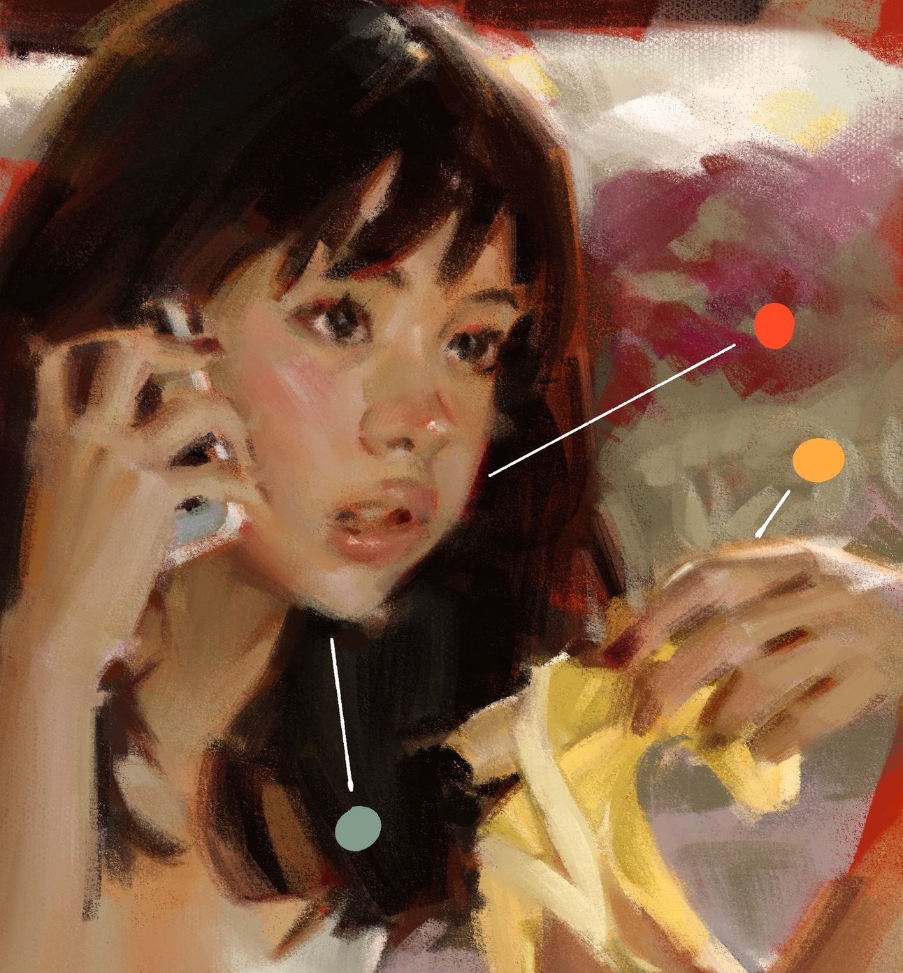
1. Cool green under the jaw
Not caused by reflected light, but used intentionally to exaggerate the cool undertone of thin skin. This soft green also balances out the overall warmth of the image.
2. Red-orange tint behind the head
This ambient warmth boosts the skin tone and connects it to the background, supporting a cohesive temperature throughout the piece.
3. Orange glow on the back of the hand
A subtle way to suggest backlighting—light filtering in from behind and pushing softly through the edges.
Color placed to neutralize, not to outline —
how green helps warm skin tones breathe.
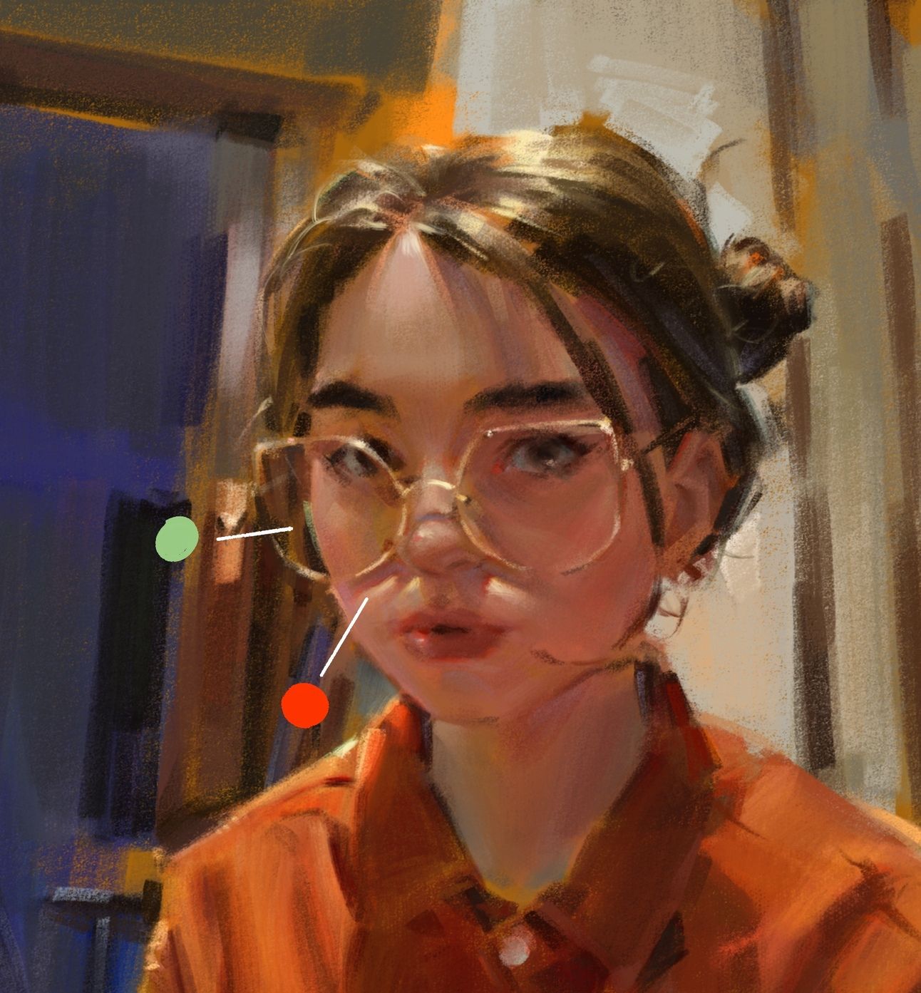
1. Pale green around the cheek and ear
Not there for realism, but to neutralize the strong dominance of warm tones throughout the piece. This ambient green acts as a balance.
2. Red accent across the nose
This small stroke adds life to the face and creates a focal point of warmth amid otherwise complex color interactions.
These color decisions are subtle, but they anchor the subject in space and tone.
We’re not just rendering form—we’re adjusting temperature, balancing color, and showing how the subject breathes within its environment.
Adding color beyond the form isn’t about decoration.
It’s part of how we control visual temperature, rhythm, and atmosphere.
Where does your drawing end—and where does its environment begin?