- Drawings by Brooks Kim
- Posts
- Design Your Values, Don't Just Shade
Design Your Values, Don't Just Shade
Stop getting lost in details and light logic. Learn how to prioritize value structure to create a clear, high-impact visual hierarchy.
brooks kim
May 12, 2026
Hello, Artists!
Do you ever find yourself spending hours on rendering, only to realize the final piece feels flat or lacks a clear focus? It’s a common frustration. The problem usually isn't your rendering skill—it's your Value Design. The viewer’s brain doesn't see detail or line accuracy first; it sees the structure of light and dark. Even in a sketch, if you are only drawing what you see, you are acting like a scanner, not an artist.
1. Shading vs. Value
To level up your art, you must separate these two concepts in your mind:
Shading (Light Logic): This is a physical phenomenon caused by light hitting an object. It’s what creates the illusion of 3D form.
Value: This refers to the inherent lightness or darkness of a color, regardless of light. For example, yellow has a naturally high value (light), while brown has a naturally low value (dark).
The final impact of your drawing is the result of [Inherent Value + Light Logic] working together.
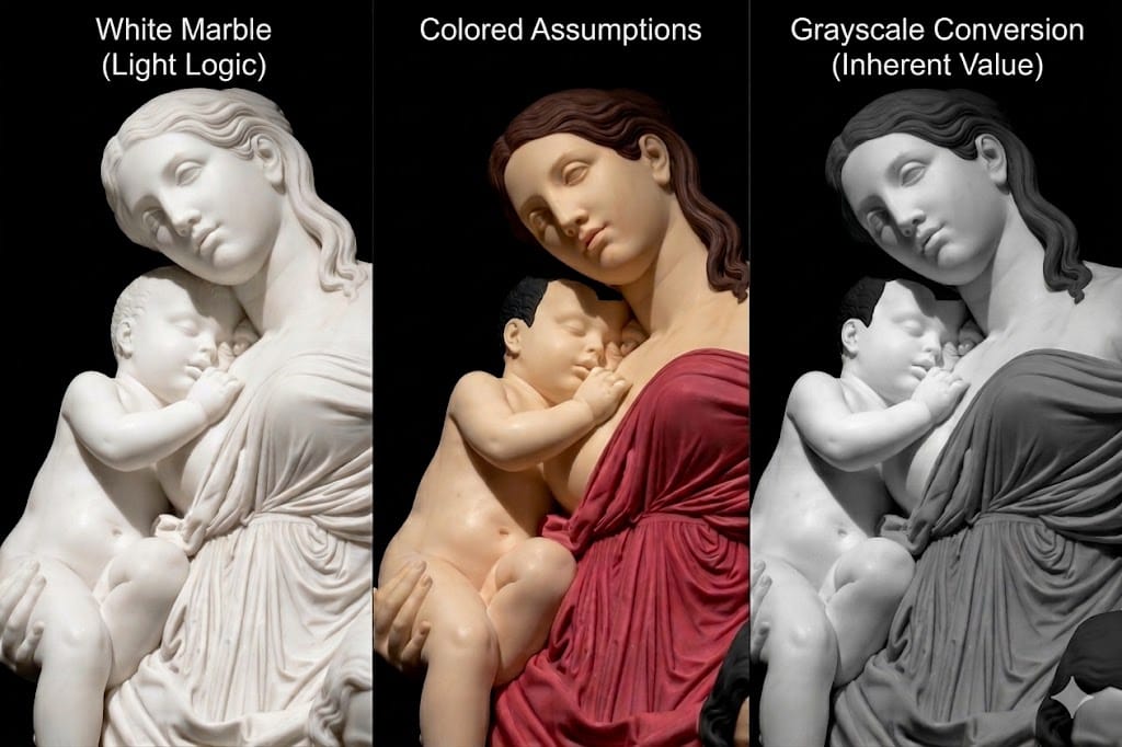
Even with the same light logic, the overall visual structure changes completely depending on how you design the local values.
2. Why your art looks flat
If you're sketching from a reference but the result feels lackluster, you might be falling into one of these three traps:
The Detail Trap: Getting buried in individual muscles or folds in clothing, causing you to lose sight of the "big picture" value mass.
The Illusion of Color: Thinking colors are different values just because they are different hues. If you don't design your values intentionally, your forms will blend together.
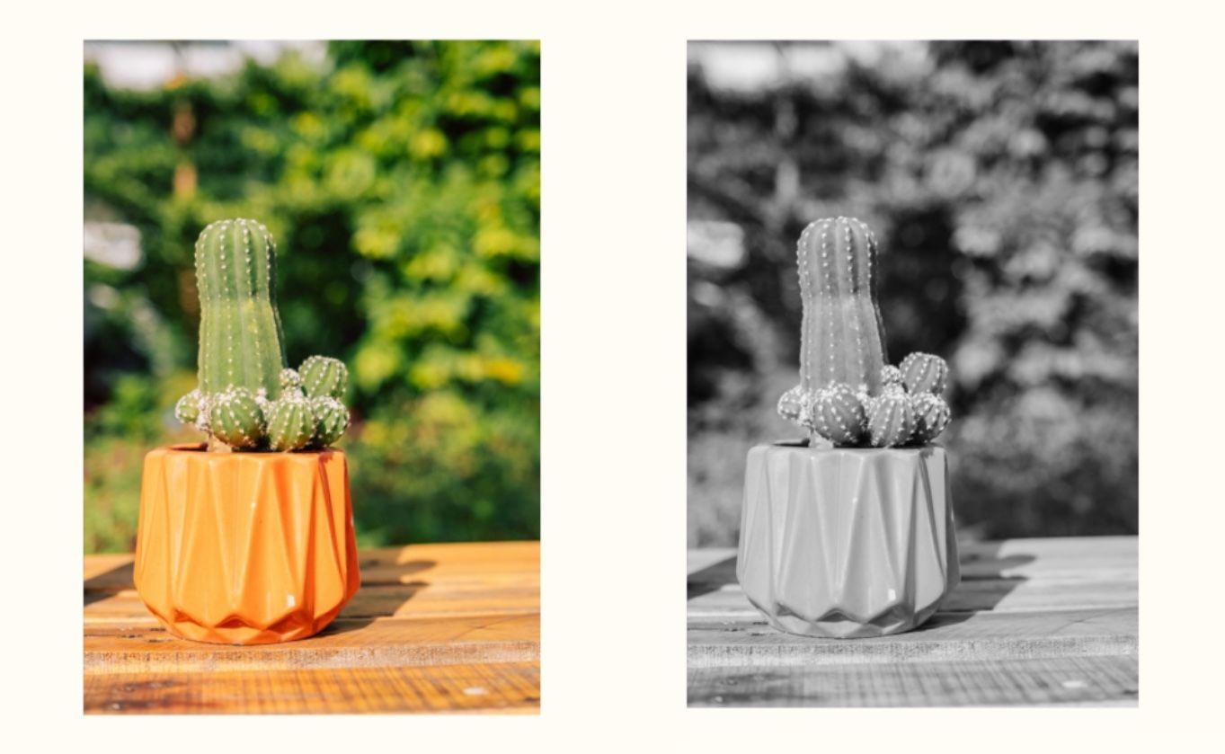
Don't mistake color contrast for value contrast. Relying only on color differences causes the forms to clump together into a single mass when converted to grayscale.
Passive Observation: Simply trying to match the photo exactly as it is. This makes your art look like a photocopy rather than a creation.
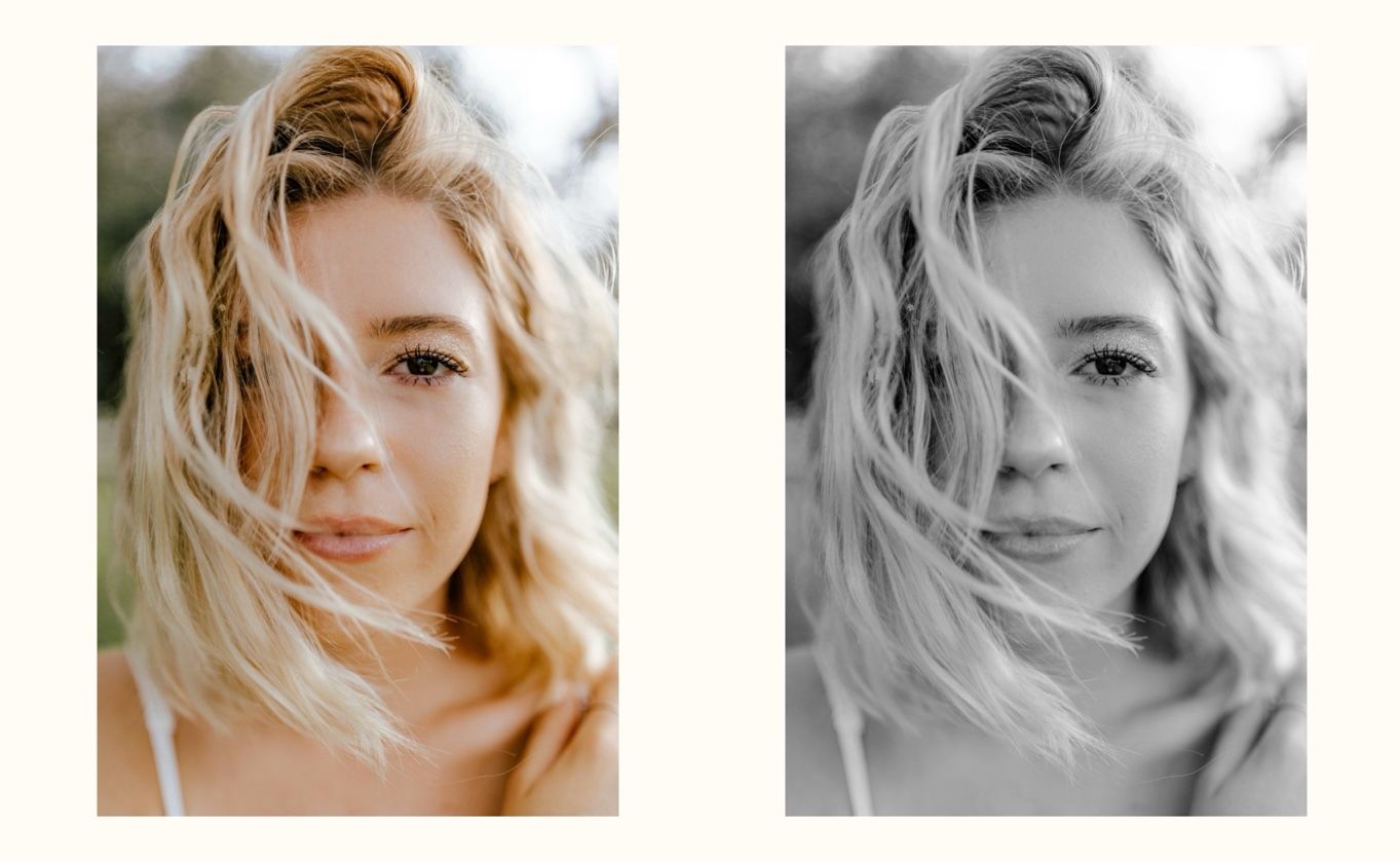
Skin and hair often share similar values despite different colors. If you don't design the values, their boundaries disappear in a grayscale sketch, leaving the image flat.
3. Be an Artist, not a Scanner
Value is not a game of matching the reference. It is a strategic tool used to command the viewer’s gaze exactly where you want it.
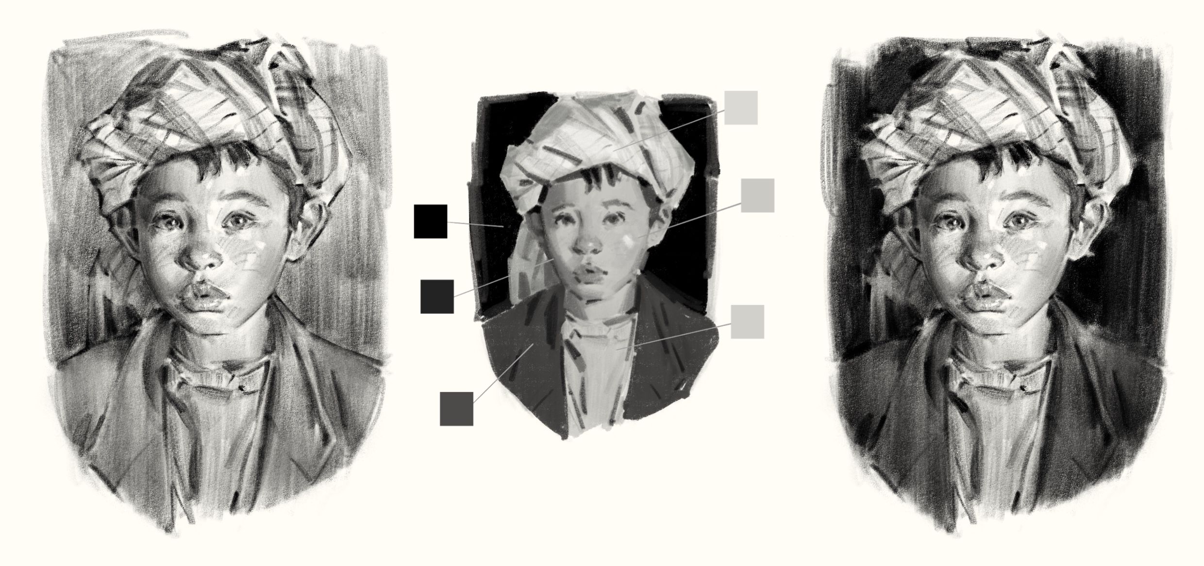
From passive copying (left) to strategic design (right). An example of grouping values to create a visual hierarchy instead of getting lost in photographic details.
Simplification: Merge unimportant areas into a single, quiet value to reduce visual noise.
Emphasis: Place your strongest contrast where you want the focus to be (e.g., the face).
💡 This Week’s Practice Guide
Before you get caught up in the details of your sketch, ask yourself: "Where do I want the viewer to look first?"
Convert your reference to grayscale.
Group your values: Try to explain the scene using only 3 or 4 values (Light, Mid-tone, Dark).
Design the hierarchy: Intentionally place your darkest darks against your lightest lights at the focal point.
Until your lines become a "reinterpretation" rather than just "filling space"—I’ll be cheering you on.
💬 Questions or Feedback? 🎨 I hope today’s lesson brings a new perspective to your creative process. If you have any questions or would like to share your thoughts, feel free to reach out to me at [email protected]. Your feedback is what keeps this newsletter growing! 💌