- Drawings by Brooks Kim
- Posts
- Drawing Note: Painting the Space Between Colors
Drawing Note: Painting the Space Between Colors
Where figure and space start to breathe together
brooks kim
October 07, 2025
Last week’s Insight Note was about seeing color more clearly by squinting —
how half-closing your eyes can help you simplify what you see
and focus on the essentials of light and color.
This week, I wanted to show how that clarity translates to the painting process —
how those simplified blocks of color turn into a living space on the canvas.
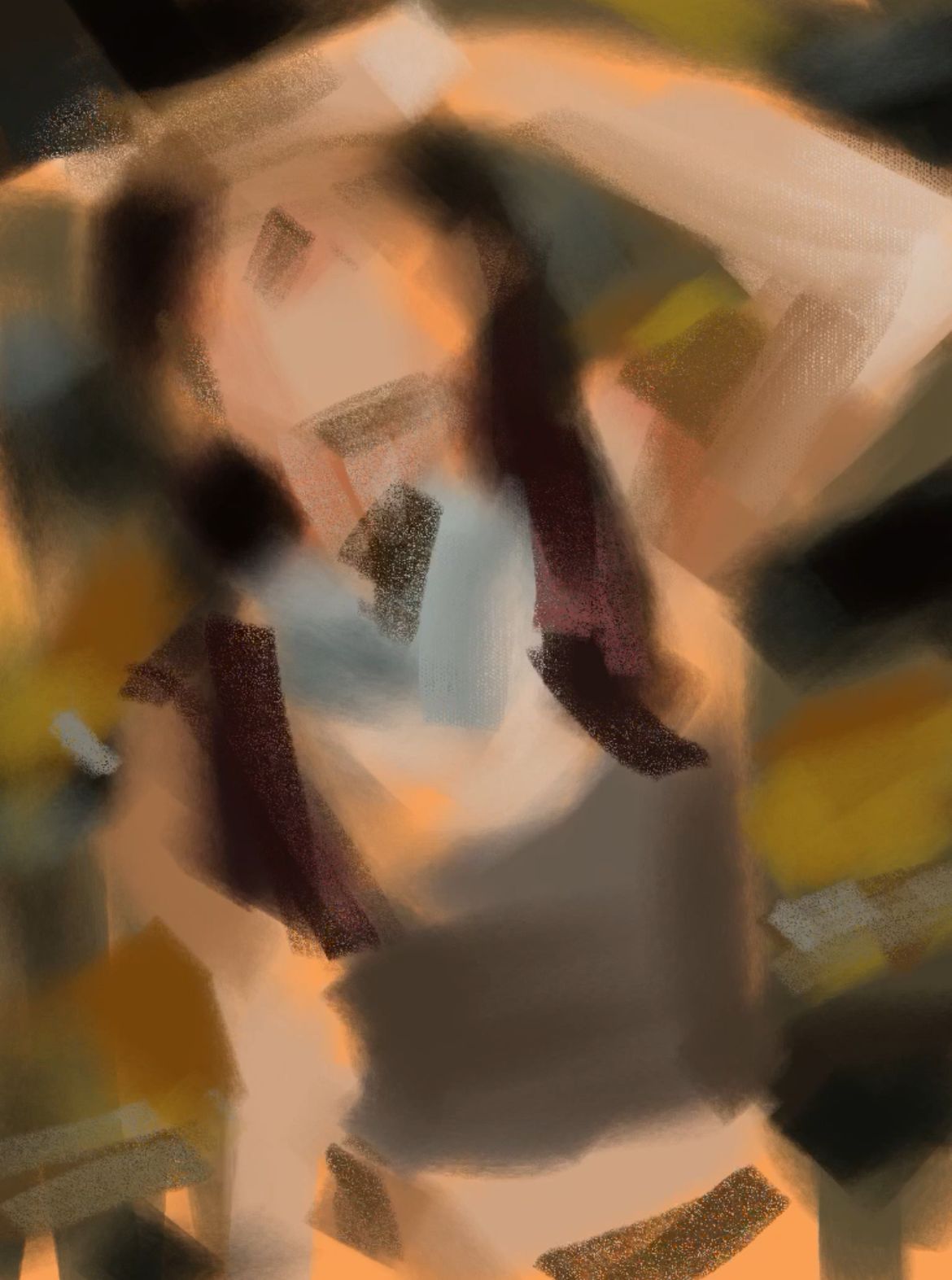
🖼 Stage 1 — Laying the Foundation of Color
The first stage focuses less on form and more on the flow and proportion of color.
I block in broad areas based on what I see when squinting —
simple relationships of warm vs cool, light vs dark.
It’s not about precision yet, but about rhythm and direction.
To make the flow natural, I use a blendable brush and Procreate’s Smudge Tool,
softly dragging along the direction where the colors connect.
This stage feels like laying down the air of the canvas itself —
the direction of light and the movement of color set the rhythm for the whole painting.

🖼 Stage 2 — Connecting Colors and Space
Here I start connecting areas with similar value and temperature.
Instead of drawing hard edges, I let the colors melt into each other.
This is where the figure and the background begin to share the same air.
The person no longer sits on top of the background,
but lives within it — as part of the same space.
🖼 Stage 3 — Building the Value Structure
Once the foundation is stable, I establish anchors of light and dark.
Strong shadows and highlights give the color structure and define where the viewer’s eye will rest.
These contrasts don’t just describe the form;
they give the painting its rhythm and tension.

🖼 Stage 4 — Adjusting Temperature Shifts
Form isn’t defined by value alone — it’s often temperature that makes it believable.
By weaving warm and cool tones together, I create subtle transitions of light.
The slight temperature shift between the skin and the background adds depth,
allowing the painting to feel alive and dimensional.

🖼 Stage 5 — Focus and Edges
At this point, I decide where to focus.
I kept the face and headphones detailed and refined,
while leaving the surrounding areas loose — the brushwork visible and raw.
Unpolished edges around the periphery make the center feel sharper and more intentional.
It’s less about finishing every area,
and more about guiding where the viewer should stay.

✏️ Tools
For this piece, I used my Color Flow Brush Set for Procreate,
which helps express both the flow and texture of color.
👉 Color Flow Brush Set (Gumroad)
Try exploring your own way of building color —
think about the sequence, the edges you choose to leave,
and where you want your viewer to focus.
If you have questions or want to share your process,
feel free to email me.
I’d love to include some of your thoughts in a future note.
🧵 Daily Sketches on Threads
I’m posting sketches and work-in-progress pieces regularly on Threads.
If you’d like to see more or share your own work,
you’re always welcome to stop by.
👉 threads.net/@9brookskim
— Brooks