- Drawings by Brooks Kim
- Posts
- From Observer to Director (Part 2)
From Observer to Director (Part 2)
Why You Should Distrust Photos
brooks kim
January 06, 2026
Hello,
Have you ever created a sketch you loved, only to ruin it when you started coloring? The drawing feels flat, or the colors look "muddy" like dirty water.
Often, the problem isn't your skill—it's the habit of "Chasing the Colors."
I often get asked, "Do you use the Eyedropper Tool to pick colors from your reference?"
I never do that, and I don't recommend you do either.
We tend to rely on the Eyedropper Tool, thinking, "If I match the pixels perfectly, it will look realistic." But photos can lie. Lighting conditions and camera sensors often capture shadows as dull grays or dead blacks.
Take a look at the cat below.

Left: Reference Photo vs. Right: My Interpretation
On the left, the colors are picked directly from the photo. Look at the color swatches in the middle—they are desaturated, gray, and dull.
On the right, the drawing feels alive. It glows. Why? Because I didn't copy the pixels; I interpreted the Physics of Light.
Here is how I applied my 3 Rules of Color to this cat, and how you can do it too.
🪄 Rule 1: "Warm Light = Cool Shadow" (Temperature Contrast)
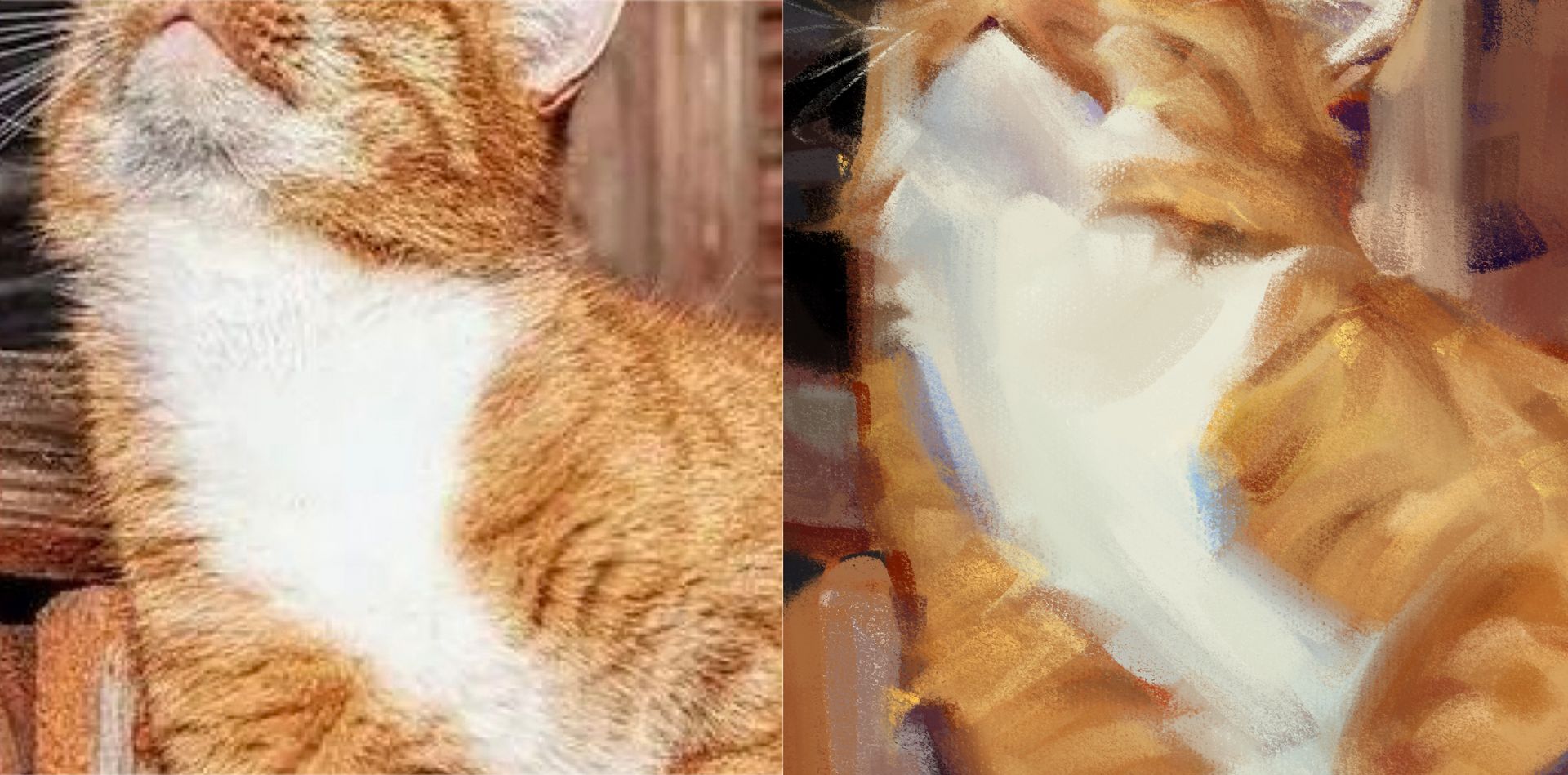
Look closely at the white fur on the cat's chest.
In the Photo (Left): The shadow is just a dull gray.
In the Painting (Right): The shadow is Blue.
Why? The sunlight is Warm (Yellow/Orange). Therefore, the shadows must reflect the ambient light—the Cool Blue Sky.
Action: Don't paint shadows with Black or Gray. If your light is warm, shift your shadow color towards Blue or Purple. This "Temperature Contrast" creates vibration.
🪄 Rule 2: "No Black in Shadows" (Chromatic Dark)
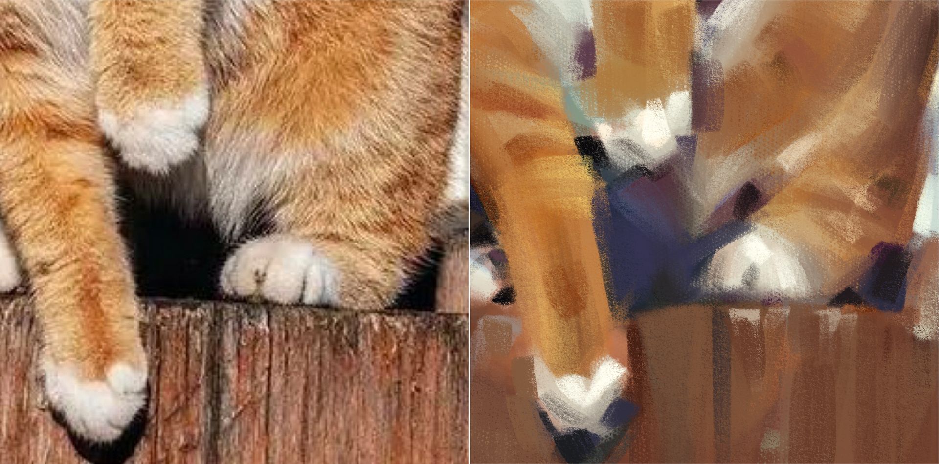
Now, look at the darkest area under the cat’s paws and tail.
In the Photo: It reads as almost pure Black.
In the Painting: It is a deep, rich Purple/Navy.
The Theory: Mixing pure Black often makes a painting look "burnt" or dead.
Action: Instead of chasing that dark pixel, mix in the Complementary Color. To darken the Orange fur, I didn't use Black; I used its opposite, Navy Blue. This creates a "Chromatic Dark"—a shadow that is dark in value but still breathes with color.
🪄 Rule 3: "Bloody Boundaries" (Subsurface Scattering)
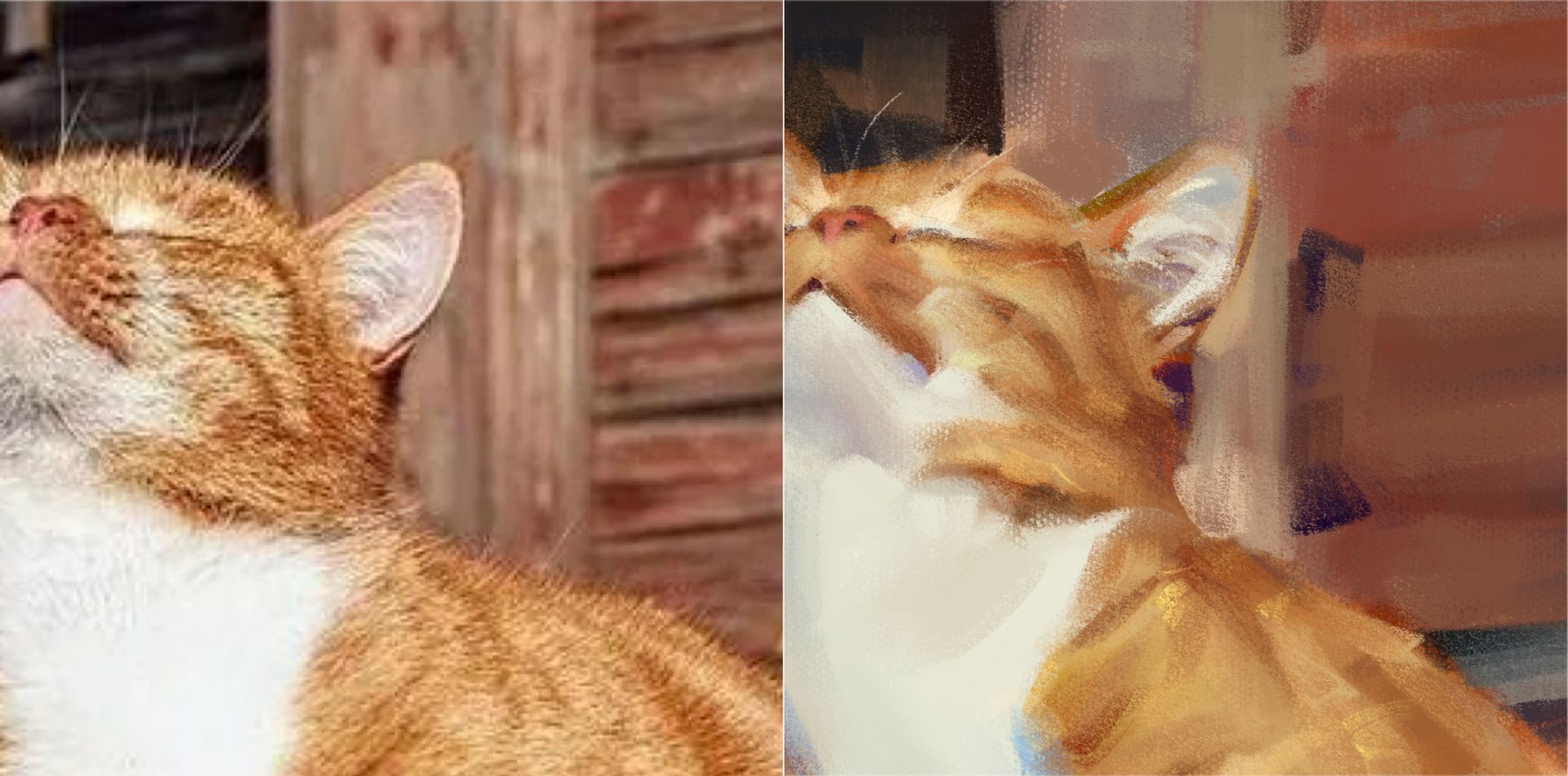
Notice the Cat’s Ears.
In the Painting: They are glowing with a hot, saturated Orange/Red.
The Theory: Thin objects like ears (or fingers) are translucent. Light penetrates them, bounces around inside, and comes out as a saturated glow. This is called Subsurface Scattering.
Action: When painting ears or skin against the light, don't just make them bright. Saturate them! Add a touch of pure Orange or Red. It screams "this is living tissue," not plastic.
[Action Item: The "Blue Shadow" Test]
Open your latest artwork. Look at your shadows. Are they just a darker version of your base color? Or worse, are they gray?
Try this today:
Create a new layer on top of your art.
Lightly glaze your shadows with a Cool Blue or Purple.
You will instantly see the atmosphere change from "dull photo" to "vibrant life."
Don't paint the pixels you see. Paint the light you feel.
Best,
Brooks
P.S. Curious about the tools I used to achieve this look?
I use my own custom set, [Brooks' Color Flow Brushes], designed to help you blend soft gradients and rich textures effortlessly.