- Drawings by Brooks Kim
- Posts
- Shape and Space
Shape and Space
How to Add Depth and Emphasis Through Value
brooks kim
September 05, 2025

When drawing figures, we often get so caught up in the shapes of the subject that we forget the role of the space around it. But how we treat the background—its value, texture, and rhythm—can dramatically shape how the subject reads.
It’s easy to forget that the background isn’t just empty space — it’s a compositional tool.
Let’s break this into two main ideas:
1. Chiaroscuro: Big Shape Contrast
The classical chiaroscuro technique emphasizes strong contrast between light and dark to create dramatic depth. This can be a helpful starting point: separating the figure from the background by using opposing values.
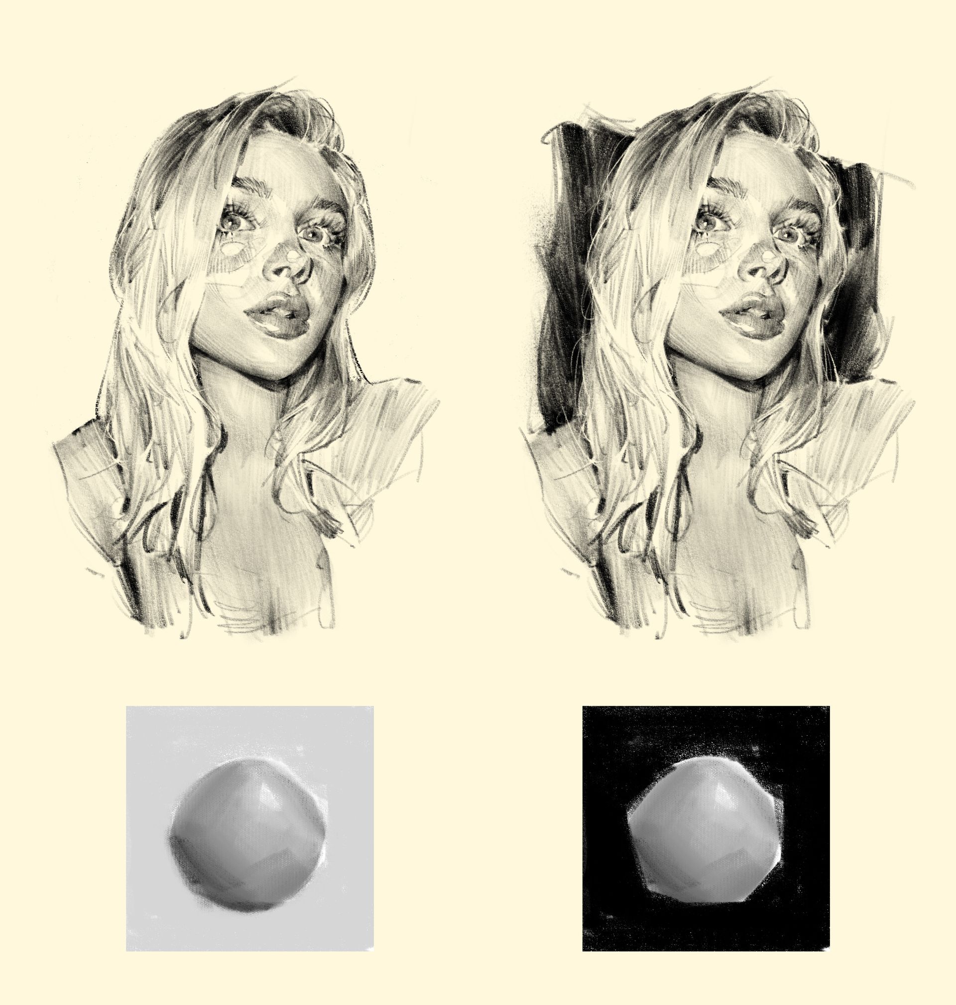
In the right version, the background is darkened behind the figure. This sharpens the contrast and pushes the face and hair forward.
2. Local Adjustments for Rhythm
Once you’ve considered the big silhouette, you can start fine-tuning areas to create rhythm and emphasis. Think of it like lighting on a stage—some spots are in the spotlight, others are dimmed.
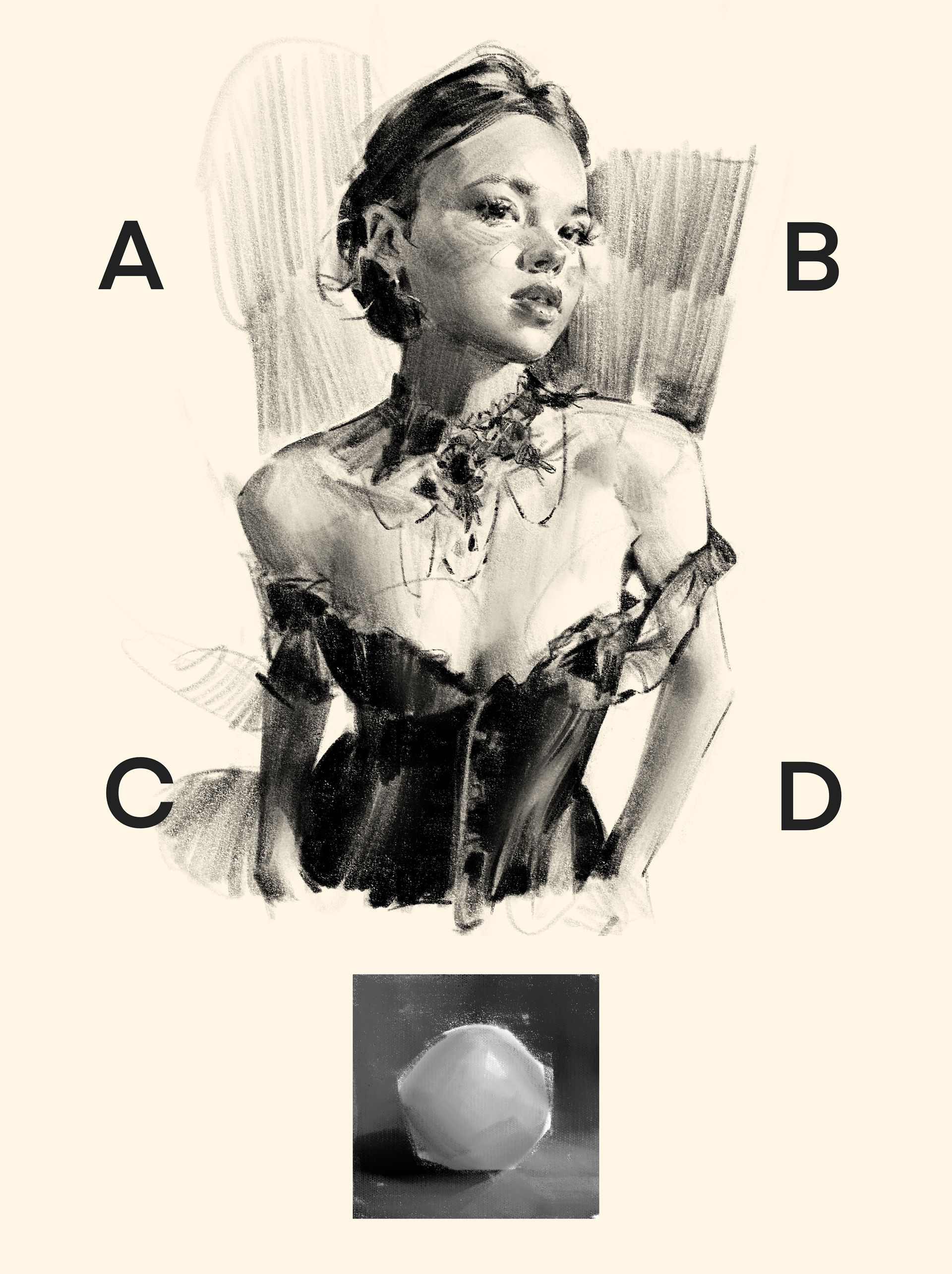
This shows how background value can be used locally to support the subject:
A: Kept light to emphasize the shape of the dark hair.
B: Darkened to help the face pop.
C & D: Background values match the nearby arm and dress, causing them to fade slightly and keep attention on the face.
This rhythm helps guide the viewer’s eyes naturally, from the focal point to supporting areas.
Final Thought
This is not just about rendering light.
It's about shaping the viewer’s attention through space and value.
By varying background treatment, you can add depth, clarity, and mood—even when drawing in just pencil.
✏️ Try this week: Choose one area of your drawing to enhance using contrast. Push the background slightly darker or lighter to emphasize your subject. See how it changes the feeling of the whole piece.
Sketch brush I used →
https://9brookskim.gumroad.com/l/qrzmk
Questions or feedback?
Feel free to email me anytime:
📩 [email protected]
—Brooks