- Drawings by Brooks Kim
- Posts
- The Economy of Line
The Economy of Line
How Less Line Can Say More
brooks kim
September 16, 2025
I’m often told that the lines in my drawings feel “economical.”
Lately, I’ve been thinking more deeply about what that might really mean.
I never set out to use fewer lines.
If anything, I’ve tried to let each line carry more meaning.
Sometimes a line might not just describe the shape,
but also suggest volume, hint at texture, or trace the edge of light.
🎯 A Few Examples from My Sketches
1. Look for mass, not strands
🐱 Example 1: The Cat’s Tail
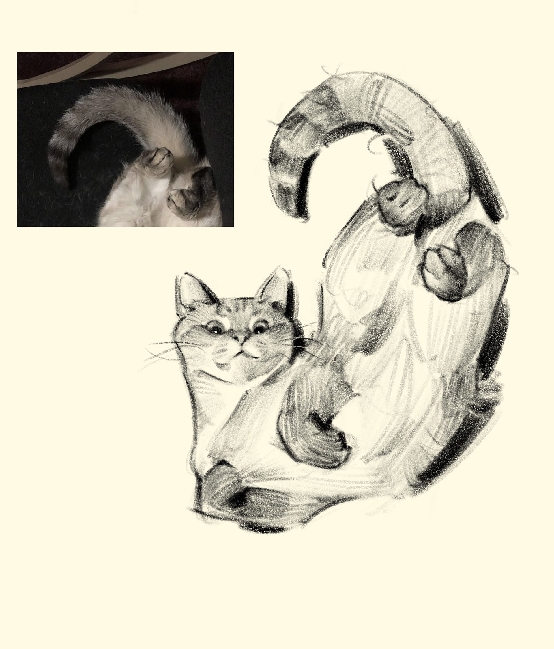
In the photo, the tail is soft, overlit, and almost blends into the background.
If I had tried to copy every hair or shadow exactly,
I would’ve lost the overall shape and energy of the pose.
Instead, I focused on the arc and weight of the tail.
The line curves intentionally to show how the tail coils in space,
and the slightly exaggerated shape helps it feel like a full, twisting volume.
Here, the line isn’t outlining fur —
it’s describing a movement, a direction, a mass.
👤 Example 2: Jawline and Neck Flow
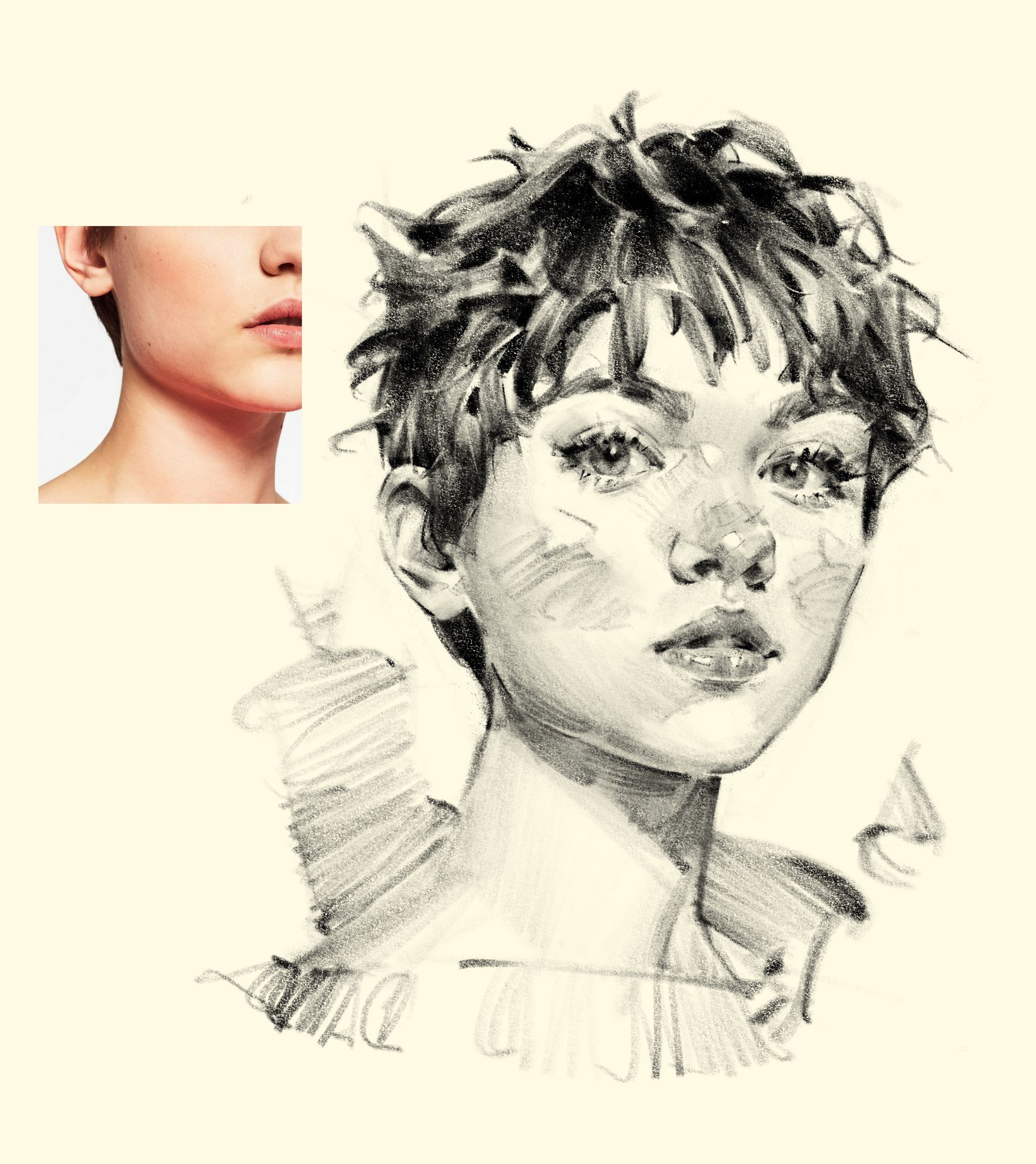
In the reference photo, the transition from the jaw to the neck is smooth and subtle —
the shadow is soft, and the shape isn’t clearly defined.
So I drew one line — not to outline,
but to mark the turn of the form where the light starts to drop away.
That single stroke also helps connect the head to the body.
It’s not dividing, it’s guiding —
suggesting how the weight of the face rests on the neck.
I didn’t draw the edge.
I drew the structure under the light.
💪 Focus: The Arm and Hand
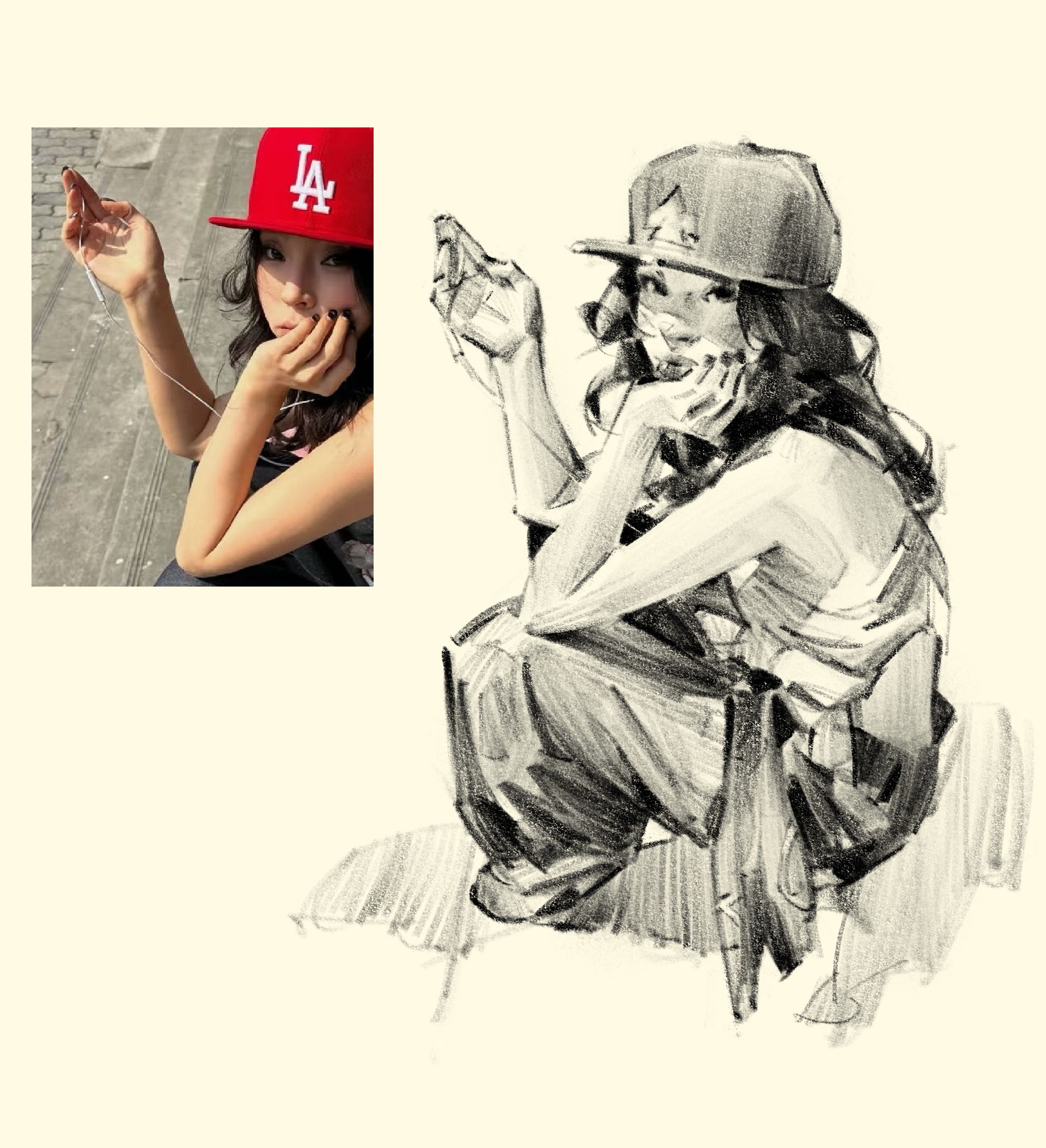
Where the wrist curves into the hand,
I slightly thickened the line to suggest the shadow wrapping around the form.
Where the two arms overlap,
I removed the line completely,
letting the light separation and edge shape do the work.
I wanted the line to describe both structure and light —
not just mark a boundary.
🎨 A Note on Frank Frazetta
If I may humbly offer one strong example of what a powerful line can do —
I’d point to some of Frank Frazetta’s sketches.
In many of them, a single line seems to hold structure, energy, and weight,
often without adding any more than necessary.
It’s not about minimalism for its own sake,
but about placing lines with clarity and force.
📌 Why Draw Economically?
Using fewer lines isn’t really about efficiency. It’s about clarity.
To draw with fewer marks, you need to observe more carefully, understand more deeply, and choose more deliberately.
Each time you leave something out, you’re making a judgment about what’s essential.
And that kind of quiet restraint is often what gives a drawing its strength.
For me, drawing economically sharpens how I observe. It also helps clarify structure. With fewer marks, each one needs to do more — and that means the underlying form has to be clear in my own mind first.
And for whoever’s looking at the drawing, the result is easier to read, less noisy, and more focused on what matters.
🖼 Try This: Thumbnail Sketches
One way to train this kind of clarity
is through thumbnail sketches.
When the image is small,
you simply can’t rely on details or surface texture —
only on the structure and key values.
It forces you to think:
“What really matters here?”
In the next Drawing Note,
we’ll look at how thumbnail sketches can help you draw more decisively
— and with greater purpose.
If you try something with fewer lines,
feel free to send it my way.
I’d love to share a few in a future issue or on Threads.
And if there’s something you’d like me to cover next,
just reply and let me know.
🧵 Daily Sketches on Threads
If you’d like to see more of my daily sketches,
I’m posting regularly on Threads.
You're always welcome to drop by. 🐾
See you next time.
— Brooks